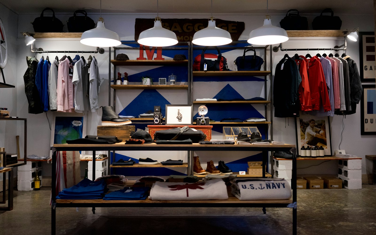
Walk into a great store and nothing is accidental: where the light falls, what you see first, how far the till is from the door. Online stores deserve the same staging.
The window
Your collection page is the shop window. Show fewer products, larger, with one clear story — a season, a material, a use. A grid of forty identical thumbnails is a warehouse, not a window.
The fitting room
Product pages answer the questions a shop assistant would: how does it fit, what does it feel like, what goes with it. Real photography in real light beats another 360° spinner.
The walk to the till
- Delivery costs shown before the basket, not after.
- Guest checkout as the default.
- Every field justified — if you don\’t need it, don\’t ask.
- A confirmation page that feels like a thank-you, not a receipt.
People do not buy products. They buy the version of themselves that uses them.
Nora Lindqvist, Design Director